maria isabel
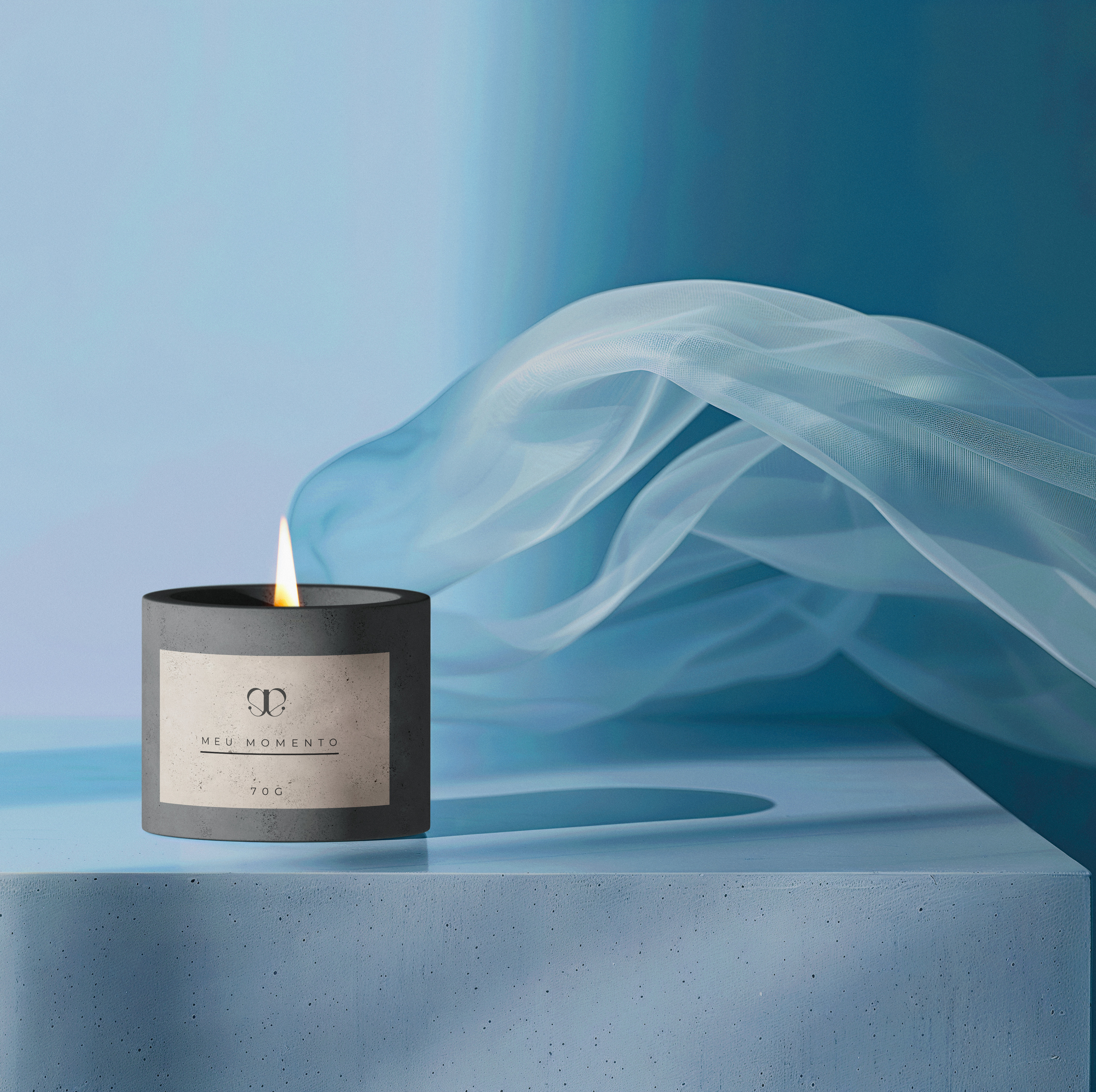
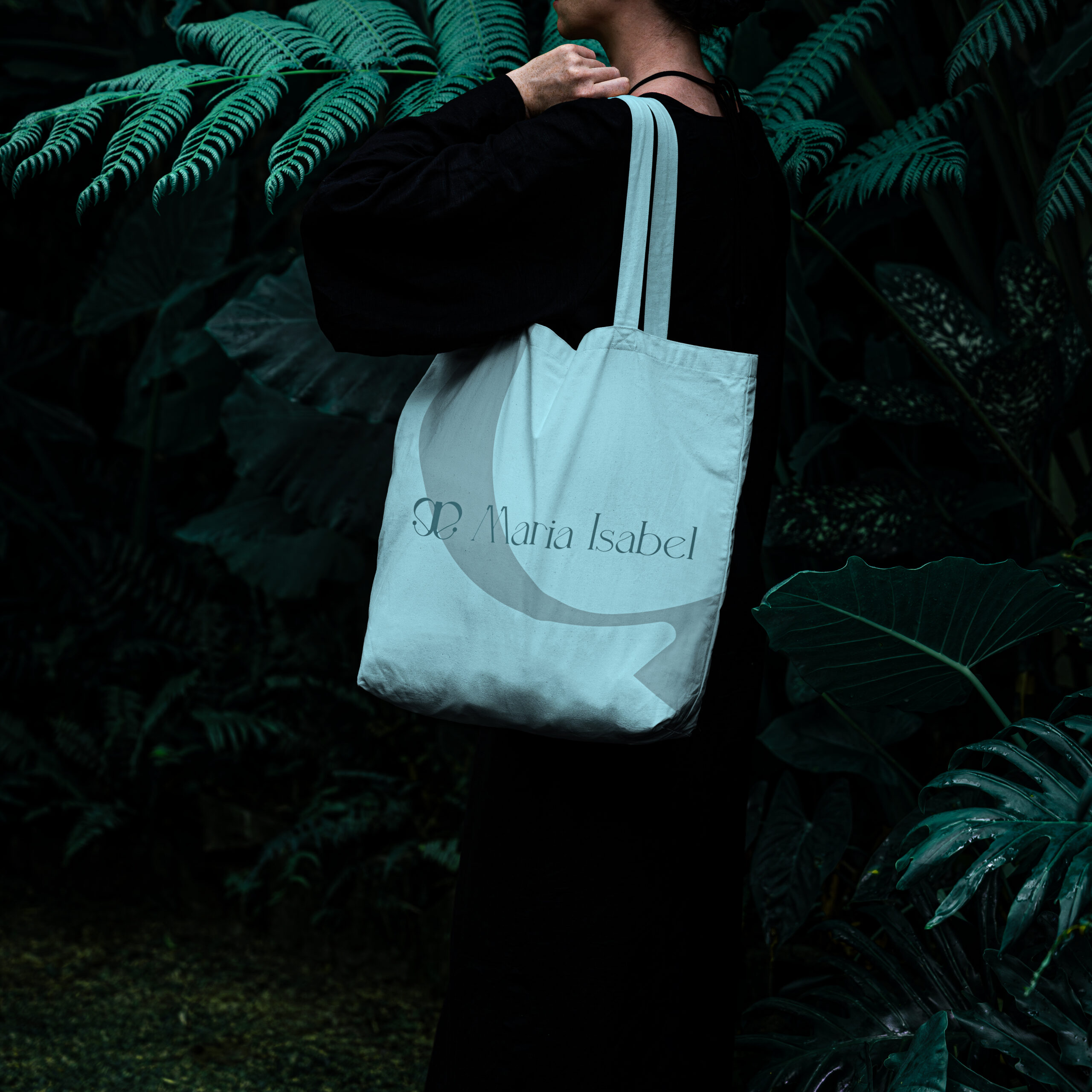
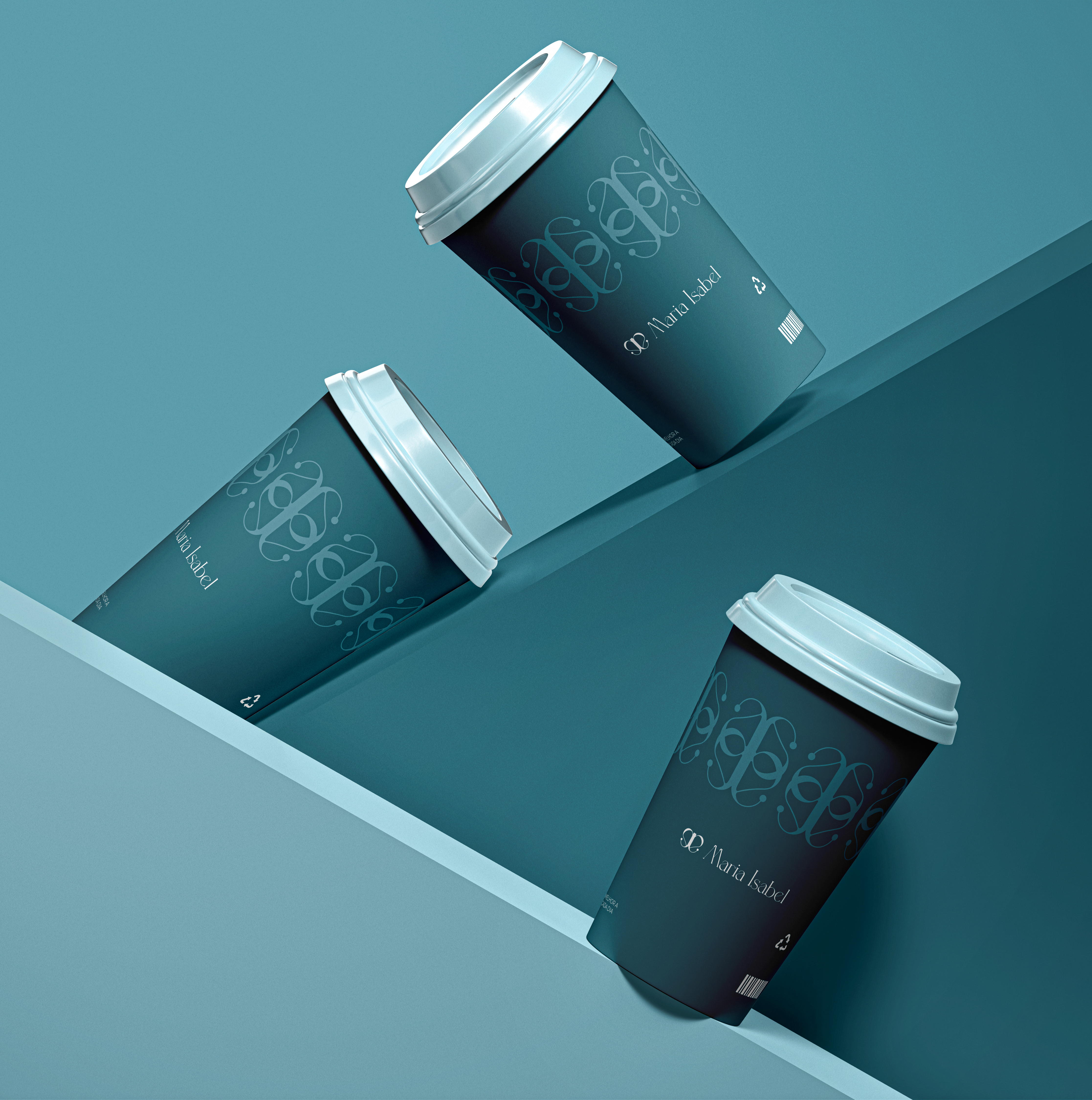
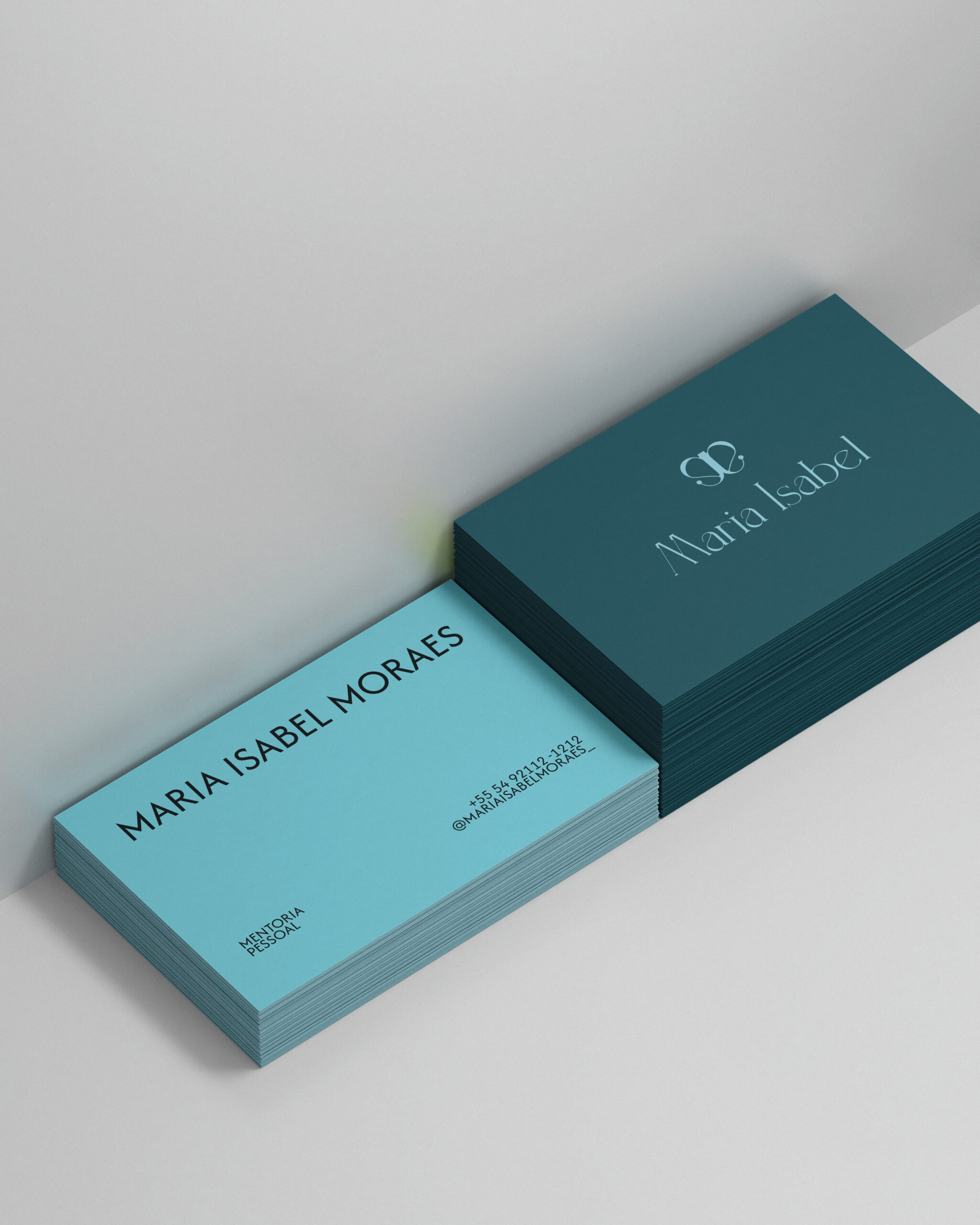
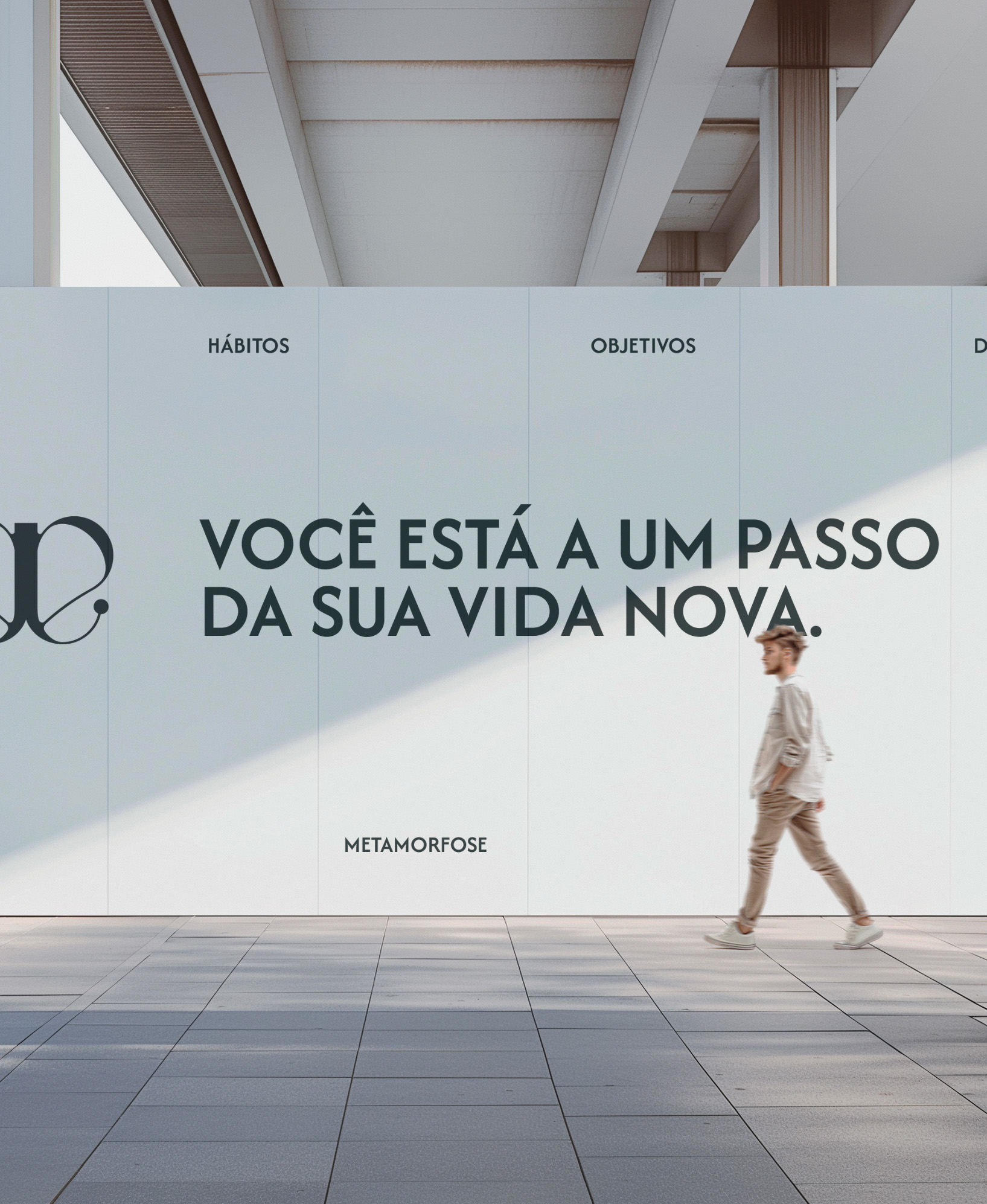
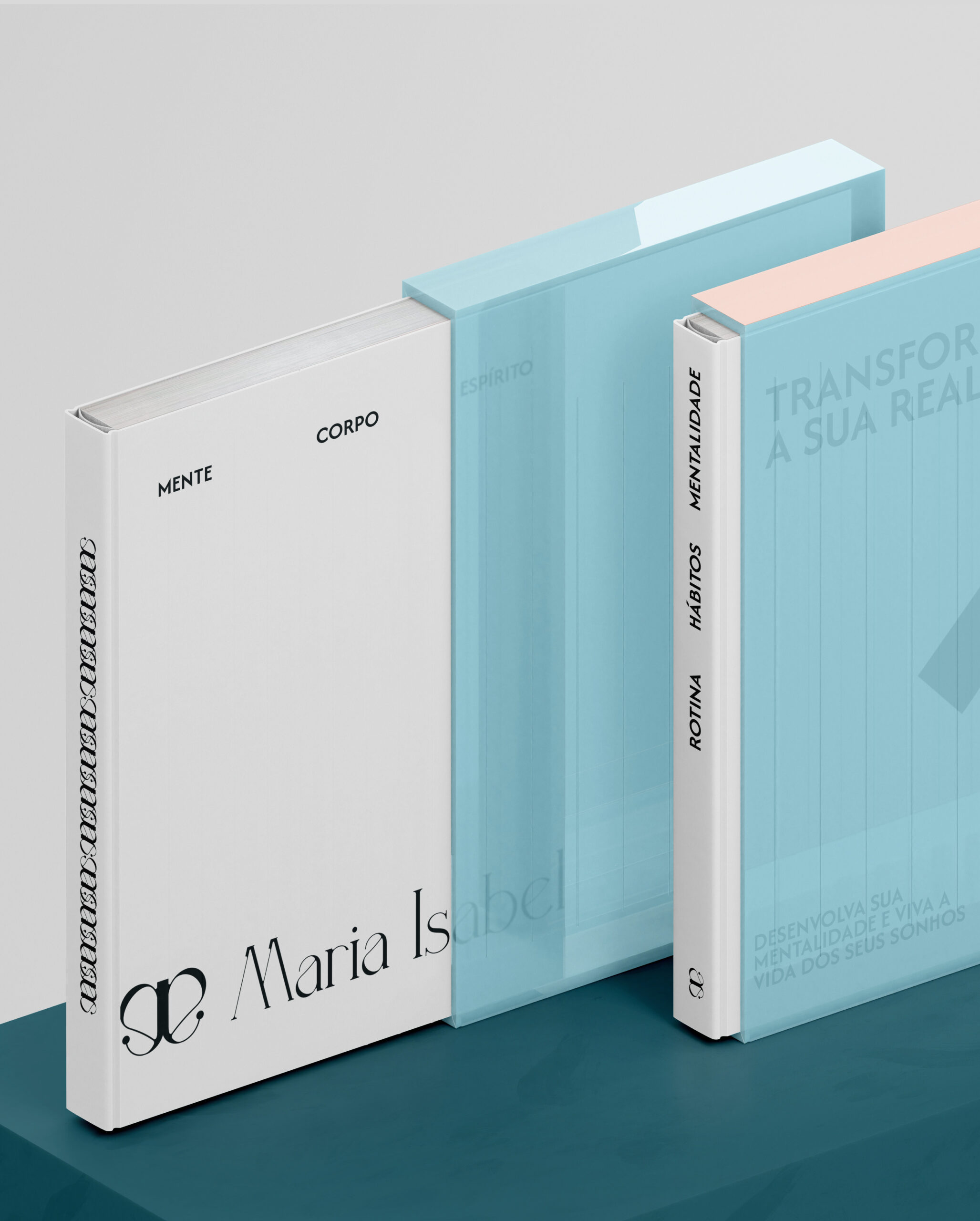
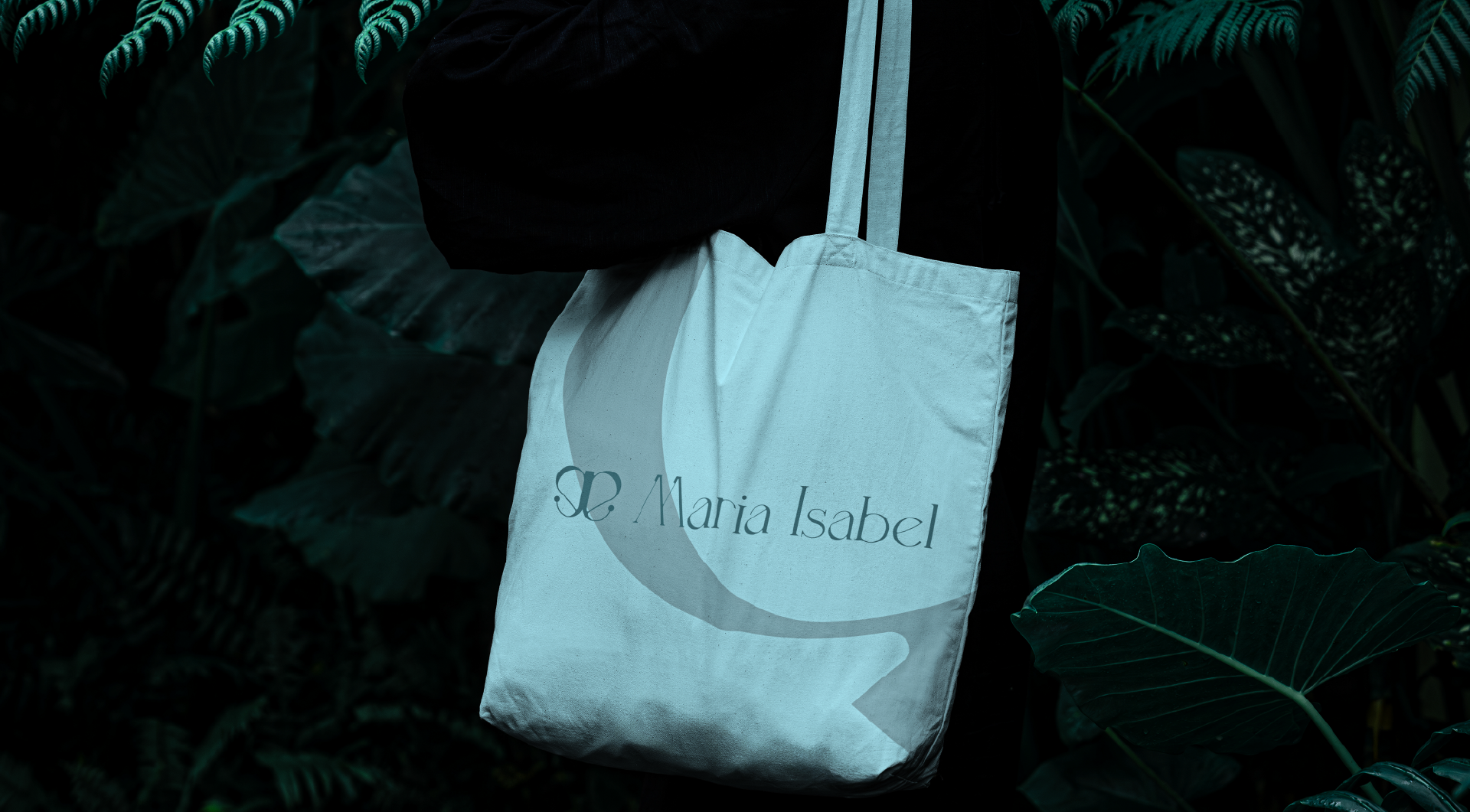
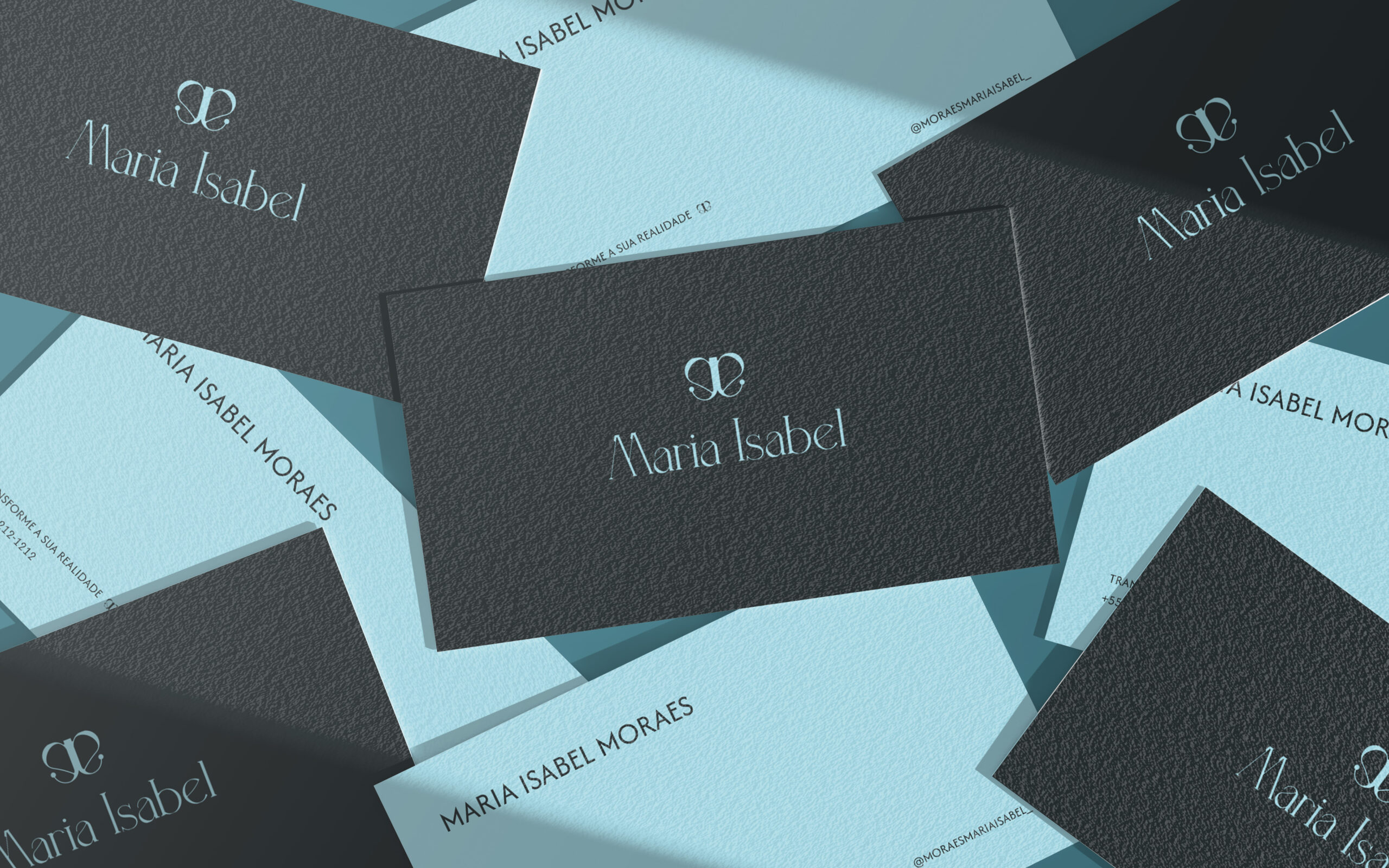
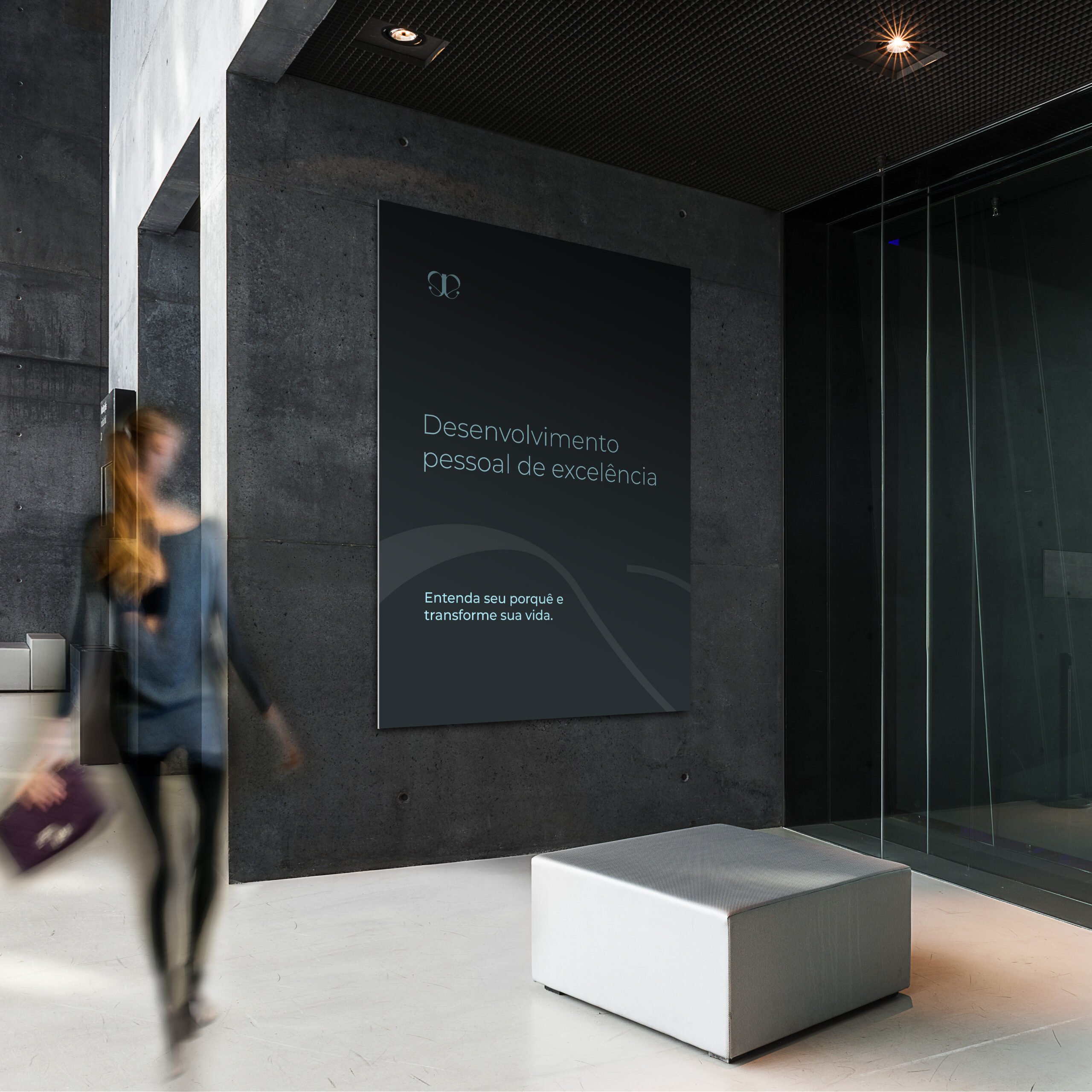
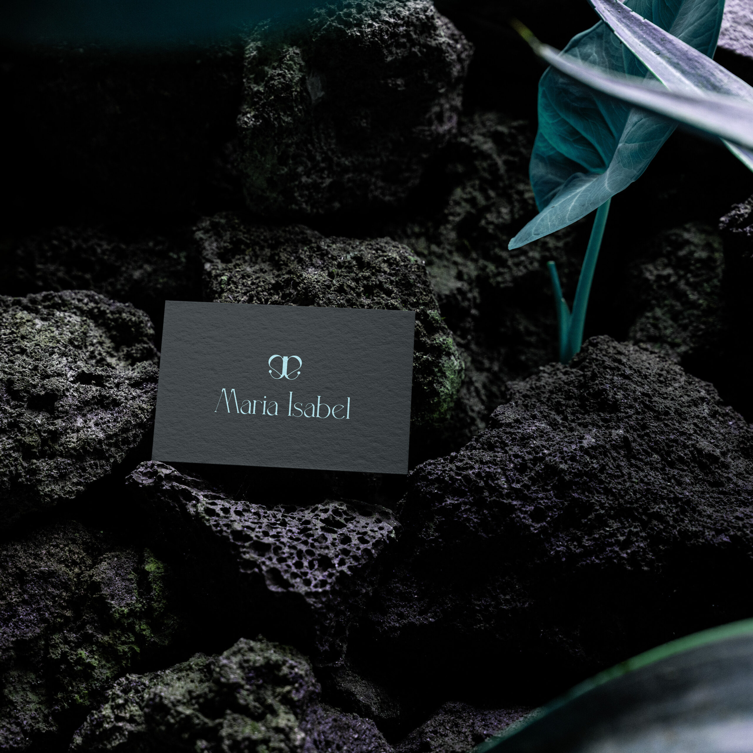
The Visual Identity project developed as a personal brand for Maria Isabel’s Personal Mentoring work was created with the goal of market repositioning. The finalization of the project takes into account the client’s desire to convey the process of transformation through the symbol of the butterfly. The sober colors are based on the archetype of the sage, while the combination of rounded shapes and fine lines represents, respectively, the nurturing of reality and the mentoring process, and the respect for daily habits needed to achieve the desired life.


